Sunday, February 18, 2024

Week 22 Feedback session


I had a feedback session from 2 industry folk: Alan Mealor and Luke Worrall.

I will do a side by side of my old version of the level and the newer version of the work.

Older level screenshot

Newer level screenshot

New level screenshot with paintover key: Luke: Orange - Alan: Blue


Overall Feedback:

The level is good so far, but it looked a bit stylised, so the aim of the feedback was to fix this issue.
If I was going for a more stylised look, it would have worked, but for my portfolio, I wanted something more towards realism.

Luke's Feedback:

Luke's feedback (In orange) mainly revolved around the lighting and lack of higher frequency detail.
In the older screenshot, the more noticeable difference is the change in lighting, he said that even though it was nice to have distinct contrasting colours with the current palette, he said to make it a little less 'utopian' it would be best to make it more overcast.


The examples he gave were of game lighting scenarios, noting that there are very strong shadows along with bright highlights.
I tried my best to replicate this without going too overboard, as when I turned up the lighting intensity or post process exposure, it ended up washing out the scene, so I tried to up these values without making the scene look washed out.

Here is an example he took of the sky, where it is seen as overcast. Albeit, more grey, but understandably so, I can see why the sky needed to be more uniform rather than blue in order to get a slightly more grungy looking level.
One of the final pieces of feedback was to add more high frequency detail - for example, I decided to add supporting pillars to the buildings, as most Victorian factory reference I looked at consisted of some sort of structural integrity. Also coming back on to the philosophy of small, medium and large details, it was suggested for the goods in to include some smaller retaining planks (highlighted in orange).
Going off the previous philosophy, the whole building would be big detail, smaller planks and cross sections would be medium and bolts would act as small detail.


Alan's Feedback:

When talking to Alan, a lot of good points were made. One of these points was the level looking a bit too kit bashed. In the original, I had green sills running along the perimeter of the building, which when compared to references we got, including factories in the Albert Dock in Liverpool, such motifs were not visible at all.
So we decided to get rid of these green sills, except the one at the bottom, as it looked like it came off the shop.

Another piece of feedback was insetting the windows - this was a good shout. Furthermore, he told me to ditch the triangular windows as the shape language was competing with the very square nature of the scene, which I agree with.
After insetting the windows, he said that using green was understandable as it was very common in Victorian Britain, however, he said try white windows instead and after looking at references, I can see why this works.

This next piece of feedback had been laterally agreed by most people who viewed the work and that was to shrink the Quoins (white corner bricks on the side of the building) as the previous ones looked too chunky for the scene.

One final piece of feedback was to add bunting - I showed Alan my previous paintover of the scene, where I added a telegraph pole with the bunting flowing from the lamppost to the pole, but he said this would have been too obstructive.

So as a way to guide the eye, Alan suggested I put the bunting across the goods in section of the level. As the main focus was towards the shop area, where the bulk of the information was leading the viewer/player.
Given that the shop was interactable and you could enter, this part made a lot of sense to me, as you want to guide the player to the most important part of the map.


Games Production: Major Project (Week - 22)

Shop interior progress:

This week's focus was continuing to do some more shop props and narrative.

Post process volume change:

I briefly went over the post process volume before, but here is the post process transition in action.


You can tell when you move between 2 post process volumes, the exterior post process volume darkens the interior, whereas the interior one is a bit lighter with slightly different colours.
I first investigated post process blending after I found an example of this occurring in Hogwarts legacy - whereby, when you went from the outside to a room inside the castle, it got darker due to you being out of direct sunlight.


Here is an example I took within Hogwarts legacy - notice how when I leave and enter the tunnel the lighting changes (Most likely due to the blend radius of the post process volume)
You can tell this by the white vignette around the edges that disappears after you fully leave the tunnel. Furthermore, additional information to back up this point is the exposure and bloom that can be seen from the tunnel that disappears upon leaving the area.
For this example, it is used to enhance the darker space, but also to replicate the real life event where [once you step outside somewhere] the light causes a bright white light in your vision for a matter of seconds before you become accustomed to this new light.

Additional props:


Here are examples of my props within the scene, to save on texture memory, I grouped the smaller props into a UV sheet, for example the props you can see on the left shelf (except the sweet jars) were put onto 1 UV sheet.


I applied the same principle to the cakes, display case and 'finest cakes' bin - this way, grouping items together makes it easier to keep track of.


UV/Object grouping for texturing inside substance painter.


Here are the cake sculpts I did inside of Zbrush.


Here is an example of the logo imported to substance painter as an alpha.

Pickup and item interaction:

For more player interaction, I thought it would be a cool idea to have items you could pick up for the player on the shop counter. 
I achieved this by following part 2 of Matt Aspland's tutorial on item interaction - https://www.youtube.com/watch?v=q62hIj9sHi0


Much like the diary, I copied the code from part one of the video, but I just created a new BP class with the additional code inside it.


This is the code in the blueprint that imobalises the player and gets them to rotate and inspect the object by holding LMB or RMB and moving the mouse, the player can get out of this by pressing E and putting the object back down.

Troubleshooting problems:
  • I have a secondary UI widget I can use on the BP class to change the text on screen to 'press E to interact and LMB or RMB to rotate' - I cannot put the new UI widget on the child blueprint class for some reason, so the current interaction prompt isn't final. Perhaps copying the Blueprint 1:1 caused this issue as it is retaining the same widget as the diary class (mainly because I didn't want the player to rotate the diary as I want them to look at it + I deleted the bottom faces for optimisation)
  • Another issue I need to fix is when placing down items, if you don't put them in almost the exact same spot you picked it up, it either floats or clips under objects. I tried to counter this by enabling physics on the object, however, this causes objects to call down when they are picked up and the player is locked to that position until the simulation is unloaded and reloaded.

Vines:


I was recently given some more feedback for my work - one of these pieces of feedback was to decorate the far wall with the curved window bay. After discussion with lecturers and peers, we all agreed it would be a nice idea to put some more foliage in this area - therefore I decided to do some window baskets with some vines coming out of them.


Furthermore, I added a small piece of bunting here attached to the metal poles to breakup the brick behind it.

For clarification, I got the vine textures from the free png section of Raw png:


From these vine images I was able to create this atlas.


By pulling a plane over the atlas, I them warped them around the metal in order to get a natural look to them, as well as curving them and then subdividing them for use with cloth paint to apply the directional wind actor force to it.

Photogrammetry hessian sacks:

A while ago, I brought hessian sacks which I thought would be useful to ustilise in my level.

Here is a diagram I made of the process.
My first step was to take images of my sacks, I did this by filling the sacks with potatoes in order to retain the shape - putting the sack in different positions to hold its shape and also tying it back with an elastic bang to act as if it was tied with string. I took pictures of about 5 different subjects to use for a randomised asset.
After taking these pictures, I put them into substance sampler to create the 3D asset out of it - the UVs didn't matter in this case as the next step was to use a square image of the flat sack to put into substance sampler for use as a tiling texture.
After this stage, I put this texture into substance painter, where I added the newly created texture, then I put a tileable stitch on the side of the texture to use as a mesh decal.
I put the sacks inside of 3ds max and used the retopology modifier with the quadriflow mode in get the best edge flow possible for this retopology.
I then exported the sacks with the unwrapped UV as seperate objects before cloning them and adding them to my wheelbarrow to use as a hero asset/more focal asset.
When this was finished, I put this into unreal and started instancing them around the level.
And finally, put the wheelbarrow into marmoset toolbag to make final renders.

Example image from the data set

Final render from marmoset of my cloth draped wheelbarrow and sacks

Cloth Simulation in max with the wheelbarrow and box set as collision objects


Further shop texturing:

To fill out the shop space further, I decided to texture some more shop goods - as it was difficult to find certain time accurate brands, I decided to make my own as well.
Using the advert for 'smith and jones relish and chutney' - I was able to create some additional props for the shop.

Here are some more samples of goods that are time period specific - although it must be noted that the Cadbury's tin is a replica of a victorian tin, which for me is good as I can get a higher resolution version of the image.

Here is the texture samples from substance painter - note the additions of the imagined brands. 

Here is the smith and jones relish pot I made - to keep it in line and look period, I made the logo myself as well as made an alpha, of which I used tri-planar projection inside of substance painter in order to make it tile.
Alpha example

Furthermore, I embossed the top with an alpha of the smith & jones logo based within the height channel.

Games Production: Major Project (Week - 21)

Level Design Changes:

As part of the constant development of the level, I wanted to create a few changes.
One of these changes was to the general level design of the level.

Highlighted in blue is already existing level design navigable paths for the player, but highlighted in red is a new level design path implemented.
A principle of level design/environment art is to push assets towards walls or boundaries as to not disrupt the flow of the level, so this new red path adds a new front to the areas in the level which can be investigated.

Audio and Narrative Story telling:

As part of some interactable features for my level, I wanted to do something unique.
For each table, there is a blueprint with a boundary collision box, when entering this collision box, the 'stand to listen' UI widget pops up on screen, which will prompt the player to stand still.

'Stand to listen' UI widget for first person view mode

The intention of this is to play an audio file of an audio recording, this audio recording will take in to account the props on the table and tell a short audio snippet based on what props are on the table. It will drive the narrative of the scene and help people understand the backstories of what has happened in this space.
Originally, I wanted to have a 'press E to interact' function on the table, but this was a bit more complicated than anticipated. So in the end, I settled on a radius for the collision and audio sphere, just so it could not be spammed constantly, I made the audio have a delay on it, when walking up to the table you could listen to the audio by standing still,. but if you walked out the sphere radius, you would have to walk up to the table again and wait for the audio to re-activate. 

Collision Box for table blueprint and audio radius


Blueprint to activate UI widget via the collision box for the table

I was able to achieve this by following Matt Aspland's Tutorial:


Reusable tiling texture workflow:

Every studio is different when it comes to making assets, but a common way to get the most use out textures to reduce draw calls is to reuse textures and have a higher geometry count to model certain details in.
In my case, I have a wood plank texture which I combined with several other wood normals, along with including an opacity map. I was able to re-use this texture accordingly on other assets.

Wood damage tiling atlas


Tiling wood plank texture

I used the same texture on varying assets, including but not limited to:
  • Wood boxes
  • Wood Planks
  • Wood damage on larger assets


Here are all the assets with the re-used texture.
In a similar vein, I utilised the trim sheet I made for the fence gate as well as the tiling green wood trim from my primary research library and I was able to put this on several assets.

As of the current state of the level, the entire scene is pulling approx. 2.4k draw calls, I am hoping to get the draw calls below 4k by the time everything is finalised, including the interior.


Additional Dirt/Environment breakup Implementation:

As an environment artist, it is important to get material breakup so it adds age and believability to the level, so taking my already existing dirt decal atlas, I duplicated the planes around the level and added different material instances that control the opacity to make the dirt buildup look as accurate as possible..

Area with no decal atlas

Area with decal atlas (Notice dirt buildup under barrel holders)

It is my intention to go all around the level, walls and floor alike and add this decal atlas in order to make everything more grungy and old - the company was founded in the mid 1800s, so you would expect a factory that's over 50 years old to have some dirty buildups around different areas.

Interior texturing:

As the majority of the scene outside was complete, I thought the next best thing was to start working on the shop interior.


The wallpaper I used for the interior - By William Morris

I continued to use assets I have available to me, such as reusing the wood for the boards on the wall. The floor is also a Photoscanned texture from my primary texture library.
The shop has a separate post process volume, as when I used the previous post process volume, it was too dark, so by unchecking the infinite extent and blending the outdoor and indoor post process volumes, I was able to equalise the colours, exposure and contrast for the interior.

When imagining the shop area, I imagined it as a 'convenience off license' type shop, as in the Victorian period, it was not uncommon to sell sweets and other goods with alcohol and that practice is still in use today.
It would be nice to unwrap as much as I can onto 1 UV sheet, including all the condiments, sweets, etc, in order to keep texture costs low.

For Further clarifications, for the hallways, I used the following wallpaper from TheFabricCo on Etsy - https://www.etsy.com/sg-en/listing/917932551/fd56577-987-56577-stripe-floral-mirage


Bunting Alpha Switches:

Recently I had some more feedback, I was told that the bunting in the level looked a bit too uniform, so I was told that it would be nice if I added some additional tears to the bunting in different places to randomise the effect.
I achieved this by creating a static switch parameter inside of the material, this was connected to the Alphas of the tears. This logic was this: 'Is torn 'number'? - true is ticked' and all the false boxes were connected to the original bunting alpha making it triangular.

This is the material with the static switches attached to their relevant channels.


This principle could be applied to all colours of bunting, they were all put in different material instances where I could hue shift the colour via a constant 3 parameter.

Brick mask:

Some feedback I received was to do extra material breakup.
One of the things that was recommended was to change brick colours.

This is my master material with exposed parameters inside of it.
I created the mask in photoshop by overlaying the non-tiled brick texture on a canvas then painting over the bricks in red, green and blue respectively on random bricks in order to get it to look more organic. By then connecting the UV coordinate to tile the brick and the mask, they seamlessly tiled together.
I got the different colour bricks by plugging in the R-G and B channels into 2 nodes: Hue shift and Darken Material, then Lerping this with the original brick and plugging in the respective RGB value into each alpha of the lerp, I was able to control each colour mask's selection via these parameters.
This mask effectively acted as a channel packed texture and because it is a mask, I exported it as a 512 in order to keep texture budgets down.

Changing exposed parameters in material instance

HUD/UI changes:

This change is more cosmetic on my end, I thought having stagnant words popping up on screen was quite boring so I changed the UI to follow the player when standing around the object.
I was able to achieve this with help from Matt Aspland's tutorial - https://www.youtube.com/watch?v=tob3GEdMJFc

This helped me get the UI prompt to float above objects - I did this in 'screen space' rather than world space so the prompt followed the player's camera in game.
It gave the level a bit more character and wasn't too obstructive to view the objects on the table. When you look down, you can't see much of the prompt, which gives the audio functions room to breathe.


For clarity, on one of my tables, I used an AI voice cloning tool as I had already asked many people if they would like to do some voice acting for my level, everyone I asked politely declined - but given I had already done 3 voices for my level, it would break immersion if I used my voice too much. So instead I opted for AI voice cloning. The voices I cloned were: Michael Caine, Cillian Murphy and Bobby Cummines using Speechify. As I only wanted to use this as a last result for voices, I thought my reasoning was justified, furthermore, I don't intend on publishing or selling the level once it is finished and under educational space, I feel within my right to do it.
I cloned the voices from the following videos:
Cillain Murphy:https://www.youtube.com/watch?v=-d125tEXBTE
Michael Caine: https://www.youtube.com/watch?v=CuhXv2wBeiQ
Bobby Cummines: https://www.youtube.com/watch?v=i--mhQWTwMs

Monday, February 12, 2024

Games Production: Major Project (Week - 20)

Door intractability:

I decided to add some additional intractability to my level, I decided to have a door you could open to enter a shop.
Although the shop isn't textured inside or out, I wanted to make sure that it was plausible before continuing to model the rest of the assets to go inside said shop.

Door and frame created in 3ds max as 2 separate objects

I made this doorframe to fit between the pre-existing walls of my level, so I created it to be 600cm compared to my other walls which were 300 respectively.

Using these 2 tutorials by Matt Aspland, I was able to create the 2 features needed for the door - https://www.youtube.com/watch?v=5-UJT4U-jeg


This is the shop front imported into the blueprint as 2 separate objects with the door pivot in the correct place to open.


On the event graph this phase is to create the door animation to open and close (Note the extra node on the end, which was used to remove the debug line tracing when a certain key input was pressed)


This section was the 'get name function' where I was able to input a name/phrase into the blueprint class name and correlate this with the widget which displayed text on screen.

Visualisation of the 'get name' on the blueprint class

This graph was to smooth out the animation, initially being either open or closed, this helped the door smoothly open. Additional problems popped up like the door only opening, but by adding a 'flip flop' function to the blueprint helped the door open and close respectively.

First person for the door:


This part of the first person graph acted as a 'get name' function for the first person character view - which correlates with the 'e to interact' name function of the door blueprint.


The first person intractability graph looked like this - where it shows the line trace feature. Within the world space, the line trace acts as a gauge to tell how far the player is from the object before they can select a key to interact. Furthermore, when the line trace is within range it will 'get name' - then followed by the set function, which will set the given name for the naming function within the door blueprint.


This is the text widget block that I used to generate the on screen 'HUD' for the player to view.


Result

Emissive static switch parameter:

For the different lighting scenarios, I was given feedback to do with interior and emissives for the parallax effect.
It was noted that it seems unusual to have lights on during the day, so I compiled the exterior lamp post lights into separate folders, keeping them apart from the daytime light scenario.
Additionally, I went ahead and made a static switch parameter for all my interior emissives, making them on or off. The parameter was named, 'Is Day?' - so when the box is checked to true, the emissives dim or switch off completely and when unticked, they revert to their original state.

Evening with emissives, lamp posts and interior lights activated

Day with emissives, lamp posts and interior lights de-activated

Static switch parameter connected to the base colour and lerped between a darker value meaning 'off' - and the false connected to the remaining emissive.


Both interior offset variations (Note the static switch parameter being on or off depending on the time of day)


Historic research:

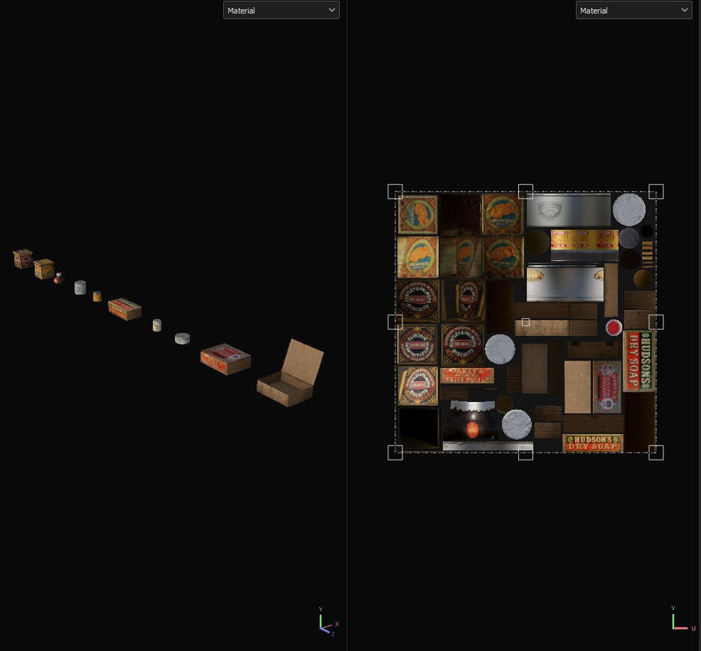
I have collated some research for foodstuffs from the time period.
It was very difficult pinpointing the exact date for most of the items, this list is also by no means extensive and I will continue adding to it.
However, I am fairly confident that most of the items I have gathered are floating around this area of Victorian and Edwardian Britain.
There were some older antiques I managed to find, however, after reverse image searching and looking at auction sites, a lot of them were misleading. Some of the items were in fact from the 1930s and 40s, meaning that it was out of the time period I was aiming for.


Shopfront texturing:

In the past, I always used to put the entire mesh of a building inside of substance painter to texture, which isn't the best way to texture, knowing this, I went ahead and made 3 texture sheets for the shop front.
1 for a decal atlas, 1 for the door and another for the shop itself.
All of these consisted of textures I had taken for my photo library. After my recent visit to abbey pumping station, I took pictures of painted green wooden planks, I then put these into substance sampler to create a texture.

Green painted wooden panelling from primary research texture gathering


Result after tweaking inside of substance sampler

I then took this and exported the result into substance painter, I proceeded to make a material ID in photoshop which I could then tile the needed textures on to.

Shop material ID

Finalised shop textures (Base colour)

Foliage:

One thing that was mentioned I should try, that is crucial for main-line environment artists is foliage. It didn't have to be anything large scale, just something to help the overall scene and showcase my skill as an environment artist.

Here is the hanging basket I ended up making.

My mum always used to do pansies in a hanging basket, So I went ahead and made something similar.


Here are the 2 decal atlases I used for the process, both at 512.
One consisted of the leaves and stems, the other of the main flower.
I used the background in colours I hadn't got on the other pieces, such as red for the leaf background and green for the flower background and use this as an ID mask to mask out the background in painter on the opacity channel.

By overlaying planes on these sections, I was able to build up these layers inside the basket I made.


I made this trim sheet inside of substance painter for the hanging basket, consisting of various sections with opacity which I could use a plane on top of.
Furthermore, for more intractability, I am going to make the foliage move via a simple grass wind in the unreal material.

I recently went out for a meal, it was quite windy and the hanging baskets were moving, I believe it would be really nice to make them move via a level sequencer along with my other moving objects like the bunting.

Material Breakup:

I went ahead and started to add texture to the level.
Some feedback I got was, even though the materials were good, I needed to create some material breakup - initially, I wanted to see if I could do this in engine, preferably with some sort of 'world space ambient occlusion' where I could utilise an ambient occlusion between 2 meshes to add dirt buildup, however, I couldn't find a material function that would work suitably enough for this scenario.
Instead, I opted for a decal atlas.


This is the material ID I made in photoshop - the green represents the dirt part of the atlas, whereas the red represents opacity.


Here is an example in the level with the applied material, as well as the dirt decal atlas. After analysing dirt build up in real life and via reference images, it would be in crevasses, as well as between objects (which proved my 'world space ambient occlusion' method was not annul)


The most important part of the material was this section - I included 3 material parameters:
  • Hue shift (Dictates the colour of the decal)
  • Material lighten (Dictates how light the decal is)
  • Material Darken (Dictates how dark the decal is)
My philosophy behind these vector parameters were so I could colour match the decal to the material behind it, or alternatively, affect the colour in a more artistic way. For example, I could make the colour even darker than the base atlas if the decals were in shadow.
The most important part about the material was the Opacity Intensity - I multiplied the base alpha value with a constant parameter, I did this so the base alpha wouldn't override and would make the entire material visible. I could also control the opacity to make the underlying material somewhat visible, meaning I didn't have to use a deffered decal to show the underlying normals and AO, in turn, making this method more efficient.

Painting research:

I wanted to fill out some of the interior space, to do this I created an atlas for some paintings to hang inside the visible interiors.

I looked up some 'British Victorian paintings' and this is the selection I made - additionally, I added a tiling frame across the top to utilise as much texture space as possible.

From Left to right:
  • (The outlier painting - The heard of the Empire - Niels Moeller Lund, 1904)
  • Landscape painting - John Constable (1776-1837)
  • Equestrian Fox Hunt - Robert Stone (1820 - 1870)
  • Countryside painting - J.M.W Turner (1775-1851)
  • Football - Thomas George Webster (1800-1886)
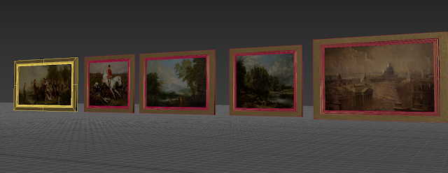
Modelled painting examples, including frames

Level texturing:

As part of the progress of the level, I wanted to document my use of texture making.
To make my levels look believable, I used Substance Sampler to capture textures, most of these were captured directly on campus.
One of the main examples being the white brick texture I used for the bottom of the buildings


Here is an example of the level where I have used the white brick texture, I also included the Absolute World Position dirt technique I used on the omnibus to create more material breakup.

Here is the photo reference I gathered on campus of the Hawthorn Building, where I captured the texture I used for the level.


Here is another example of Crosswise brick paving that I captures in Loughborough - When taking these reference images, I capture them in a square aspect ratio as to reflect the actual texture size, I also get the photo as aligned as possible in order to make the tiling, alignment process easier, furthermore, it makes the sampler process for texture creation simpler.

Texture aligned and tiled inside Substance Sampler

One issue I come across when doing this texture method is the tiling needs to be slightly greater and I find that the tiling function is pretty hit and miss in sampler. So I take the exported textures and put them inside of Substance Designer, where I add a 'make it tile patch' to each texture and then re-export the textures as this gives me a lot more control over the material than Sampler does.

Texture tiling in Substance Designer