This week was focused on adding more complex geometry to the blockout and adding some additional props, this included a focus on lighting.
Complex blockout:
.png)
 |
| Complex blockout with additional assets |

To help with some of the push towards realism, I decided to model some bricks, which would go on the sides of the brick wall. The bricks were designed with the intention of affecting the silhouette and make the asset look more organic. I did this by sculpting the bricks in Zbrush, then Zremeshing them to make a lower poly version, I then imported all of the bricks as individual assets and pulled them in to place around the wall.
 |
| Zbrush brick sculpt |
.png)
Using the methodology for most modern games, especially Call of Duty, to model in the tiles so it looks more real - 'You can use geometry, but textures is what matters most' - meaning that you can use as much geometry you want within reason, but the textures need to be kept low in some circumstances in order to keep the game running at a good frame rate.
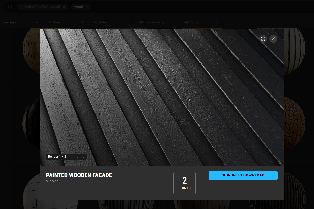
For clarity, I used this piece of wood from megascans to aid my trim sheet for the wooden paneling.
 |
| https://quixel.com/megascans/home?category=surface&category=wood&search=wood&assetId=uk3kffzn |
Blueprints/Spline Meshes:
 |
| Rail Mesh decal Spline mesh |
 |
Wall Trim Mesh decal Spline Mesh.png) |
 |
| Spline mesh blueprint - Tutorial by Ryan Laley (https://www.youtube.com/watch?v=eKIiWa19EMI) |
Here are 2 examples out of many spline mesh blueprints. The reason for using spline meshes rather than modular pieces for certain assets was mainly because it was the most ideal to shape and scale objects.
For example, if my modular wall was a few centimetres out of proportion, it would be easier to apply this spline mesh blueprint to the mesh decal rather than having to go back in to 3ds Max and remodel the entire mesh decal. Furthermore, it gave me a lot more freedom to block out some more, knowing the fact I could procedurally place objects like this, I could place them where I like and not have to worry about the sizing constraints.
I applied the rail mesh decal to a subdivided plane and extruded the rails ever so slightly. Additionally, for the concrete trim, I used a tiling texture made up of multiple strips which held normal information - this was perfect because I wanted them to tile horizontally which would make them seamlessly blend using the spline mesh.
 |
| Concrete strip mesh decal master material |
I made a master material for the concrete mesh decal which consisted of 2 normal maps, the main normal map which made it look like it has insets and protrudes from the wall - I then put a BnW spots normal map in the same material - I connected both normals to a flatten normal node which both contained 2 parameters to increase the strength of the normal. Furthermore, I added a BlendAngleCorrectedNormals in order to blend both normal maps together to add some more surface detail.
.png) |
| Concrete normal map containing 4 tiling beveled strips |
Bunting:
 |
| Waving Bunting |
To create this bunting, I made a texture of a flag with an opacity channel on it. I then pulled a plane over this texture, making sure to have many subdivisions. Importing the plane as a skeletal mesh to Unreal Engine let me apply physics and cloth to it. After dragging in a directional wind actor, I created a weight paint for the cloth, making sure to coat all of the plane except the very top (So It wouldn't fall to the ground) - Then when the level is played/simulated, the mesh starts to wave with the wind.
As an extra touch, I made a master material for the bunting containing 3 parameters:
- Bunting colour
- Subsurface Colour
- Subsurface power
Because flags like these are typically very thin, I made subsurface an option to add some extra depth. Furthermore, I created the bunting colour constant 3 vector in order to change the colour of the bunting, in this case, white, red and blue.
.png) |
| Bunting material instances with varying colours |
Decal atlas:
After browsing online, I came across megascans and saw the Atlas options they had - When put in to context, decal atlases are a more efficient way of applying decals to levels. You could use DBuffer decals which come with Unreal automatically, but this can get expensive and sometimes can only be used in certain scenarios, most notably, when you need the texture underneath to show through the decal (i.e: paint on brick).
All you need to do is apply your decals to a plane with opacity, then you can drag the texture over another plane and use that as a mesh decal.
.png) |
| Megascans Decal atlas example The method I used Varied, I did the word decal atlas purely in Photoshop and exported it with an alpha because that was all that was needed. But for the more complex decal atlas example, I imported the texture and a Material ID from photoshop and applied it to substance painter. I did this so I could add extra surface detail, such as roughness, metallic and normal values so they looked like they belonged in the level. .png) Word decal atlas with alpha channel .png) Sign decal atlas with Material ID Used to invert the mask to add opacity .png) Old advertisements, adding extra depth through various, roughness, metallic and normal/height parameters. Period:
.png) Example pulled from the Black Country Living Museum, which has old town style Victorian architecture and advertisements that were prevalent during Victorian and Edwardian Britain.   Logos as decal atlas on boxes. This logo decal atlas was designed to put on boxes and on beer bottles, as normally glass shaders in unreal are pretty bland and uninteresting. I could have easily put a scratch mask or dirt mask on the bottles, but instead decided to give them a bit more character by creating this decal atlas for them. Each one of these logos is representative of a beer, for example:
3rd Lighting Pass: When doing my initial lighting passes for the level, I realised that a lot of the lighting was too intense. Wanting to go with a sunset/evening theme, I went ahead and re-adjusted my lighting, using settings from the light mixer, such as sky atmosphere, exponential height fog, directional light etc, I was able to achieve a much more subtle, less intense result.  This was my first lighting pass with way too much colour LUT contribution and incredibly harsh light shafts and clouds.  This was my second lighting pass with less intense light shafts, but still way too saturated and untouched harsh clouds. The big take away from these level screenshots is the fact that less is definitely more in this case. Although the clouds would still need some final tweaking before the level finalisation.  Example of early evening sky that I took. Receipts and blowing receipt Niagara system:  This is a Niagara system and a mesh with clothing attached to it. In order to get the receipt to sway, I bent the plane inside of max. To make the actual wind, I made a material for it, by adding a simple grass wind, I was able to get it to sway. Creating a cloth skeletal mesh didn't work as the edge fell to the ground as it added physics and gravity to it. So in order to get the very end to sway and blow in the wind, I added a gradient to the Alpha of the Channel packed texture as to only affect the curled area.   So it wasn't too over the top, I made sure that my Niagara system only spawned in one receipt at a time, this would add some more depth to the scene as well as extra intractability. Chimney Stack Heat Distortion:As an extra layer of believability, I wanted to add something I knew would occur in the level. I remember seeing heat distortion coming from the rig on oil rigs, but the most common form of heat distortion is when planes take off, you get a wavy mirage effect.  I went ahead and created a shader for this type of effect  Settings with parameters controlling options such as:
I plugged half of the settings into the refraction in order to get it to look see-through, this in combination with the opacity helped it look like heat distortion. 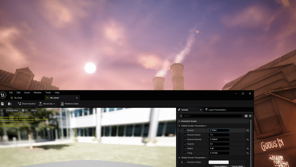 Paintover of level:I wanted to see how my level would look when doing a paintover of things to include.  It is my intention to do some additional assets, such as s horse drawn cart that will carry some goods, like bags of wheat. Furthermore, there will be some drain pipes I will incorporate around the level. Textures like cobblestone, more bunting and a telegraph pole with ladder. At this stage, it is hypothetical, but I would like to create another intractability feature that consists of a 'snake oil salesman' cart that has some jars you can pick up and put down, which would add a nice touch to the level considering the amount of space I have to play with. Blackboard: This is an example of this stage's prop texturing - When I went to the black country museum as a child, I remember going into one of the buildings where we were delivered a session with a blackboard and I thought it would be fitting to use an asset of the time to write a message dedicated to the coronation.  Here is one of the main alpha stamps I created within photoshop to use to add the written detail within substance painter. |
No comments:
Post a Comment