Further Feedback:
Throughout the development of the project, I have had a lot of feedback from multiple people. To give the project that final push I wanted to ask many people for feedback in order to improve the project as best as I could for submission.
Kras' Feedback:
I was speaking to Kras about how I could change a couple of things within the level. One main thing he pointed out was the sun and its colour.
In original screenshots, the sun always had an almost off-white colour, but Kras recommended I change this to a slightly more saturated colour to imply the sun.
 |
| Older screenshot with slightly washed out colours. |
 |
| Newer screenshot with slight light saturation and darker shadows (I intend to put a separate light next to the bollard to give it some ambient light via a new lighting channel.) |
Another suggestion that was recommended, to deform the regularity of the playing cards on one of the tables.He mentioned - 'think about when you drop cards, they would scatter in this pattern due to the way you hold them, but there wouldn't be this arc to it'
This was possibly to imply that the fellows at this table may have needed to leave in a hurry, or in a drunken manner, put down the cards. Which would result in a harsher put down of the cards and wouldn't be as elegant as the initial screenshot.
 |
| Cards in arc format |
 |
| Cards in new arc format with several cards being displaced |
When looking at my shop Kras mentioned something about lightshafts, so using the pre-existing materials and meshes from my other lighting scenarios, I used.
I was speaking to a peer of mine, Petros. He suggested a few things, one of the main things was to have a little bit more breakup on the roads.
To do this, I used the same technique on the cobblestone that I did for my bricks.
Where I added an RGB mask I painted on top of the texture in photoshop and used this to divide some of the pieces of cobblestone into sub-sections to light, darken or hue shift at random intervals.
 |
| Older cobblestone without randomness |
 |
| Newer cobblestone with randomness (Notice the slightly different coloured pieces) |
Furthermore, I enhanced breakup by adding some more subtle atlases to the top of the cobblestone.In this example you can see slightly darker black specs and off coloured dirt from the other decal atlases I have used around the level.
Sam's Feedback:
I had a meeting with Sam Taylor from realtime who advised me about a few things in my scene.
He pointed out a couple things that could be changed.
List of changes:
- Water pump: It was noted that my normal intensity was too high on the water pump causing it too look too bumpy. Furthermore, the rust buildup wasn't realistic enough, because rust occurs with water and oxidisation and I didn't have rust around the pooled areas like it should be.
- Large Barrels: The large barrels in my scene are nicely detailed, however, they could do with having the wood detail be smaller as the wood grain looks too large at the minute.
- Numbered jugs: The jugs in the shop have labels on them, but from a distance they look too bright and they stand out the most when entering the shop.
Water pump:
 |
| Pump without rust |
 |
| Pump with rust |
Large Barrels:
 |
| Barrels before change |
 |
| Barrels after changes (Increased normal intensity and grain size) |
Jugs:
 |
| Labels before changes |
 |
| Labels after changes |
Gabrielle's Feedback:
Gabrielle mentioned a few things I could add to my level.
One of the main changes was for the shop interior, he mentioned to me that the wood floor was tiling too much, so some break up was needed.
This is how it looked with wood flooring (He also mentioned about having some smaller assets to act as an 'aisle' within the shop - but I will cover that in the next part of the feedback)
Here is the shop divided into 2 sections with wood and carpet, I made the carpet within substance designer.

Small shelving unit change:
A few posts ago, I tried to justify me not having items in this area because it would take up a lot of room.
But since then, I have planned out what I would do next.
Gabrielle mentioned that I could take the already existing shelving units and just cut the size of them down in order to reuse the asset.
What I did to achieve this was to make a duplicate of the mesh and cut it so only the bottom 2 crosswise pieces of wood were present. I then mirrored and capped the asset before re-UVing it.
Gate:
Another suggestion that was made was to imply space outside of the level. I had already done this with one of the larger gates.
But Gabrielle suggested I added in a smaller gate that implies leading off somewhere.
So I added a smaller gate.
Teo's Feedback:
When discussing my level with Teo, she suggested some things in the level.
Shop wood floor:
One of the things that was recommended was within the shop. The wood looked a bit too uniform, it would be good to imply the wear on where the floor had been walked on.
So I did this via vertex painting.
I took my already existing texture and passed it through substance designer, to add various grunges, scratches and to change the colour of the texture.
Finally I subdivided the floor mesh and brought this into engine, this allowed me to vertex paint on top of it
Here is the floor before.
Then here is the floor after vertex paint to imply worn wood from the amount of times it has been stepped on and things have been dragged across it. Immersive Changes:
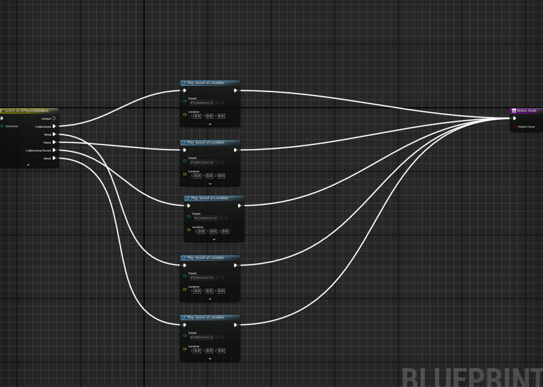
I initially had help using this tutorial by gorka games
I replaced the original sound cues with a single sound cue which played the sounds with a 'random' audio function.
 |
| Random Sound cues |
 |
| This was correlated with the Physical material directly tied to the blueprint (I changed the physics names in the project settings) |
 |
| Example of the Physical material for wood on the wood mesh |
 |
| In the animation, I called the notify that was set to call at the end of the blueprint. |
 |
| Notify calling each physical material with an attributed sound. |
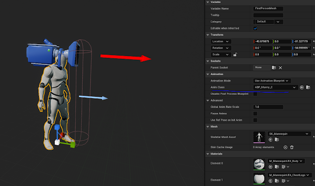 |
| Replacing the old animation class with the new 'manny' class |
 |
| New manny character in level |
Step by step process:
- I created the Audio inside of my editing software, adding various effects such as reverb.
- I then imported these to Unreal engine, then put them all into single sound cue with a random node to randomise the audio.
- Going into the project settings, I attributed all of the physical material names.
- I then created the blueprint with the previously mentioned video and applied the respective audio cues.
- I then went into the 'Manny' skeletal mesh animations and created a notify on the timeline for each of the animations that required it, such as run and landing from a jump.
- Removing the old first person arms skeletal mesh from the first person character blueprint, this was replaced by 'manny'.
- I checked on the cast shadows from the manny skeletal mesh.
Result: walking over the respective meshes with physical materials will then fire the audio tied to the physical mesh. All the while you can see the character you are playing as.
Finalising light complexity:
I took the opportunity to bring down the lighting complexity.
I achieved this by flushing certain assets down different lighting channels. My main directional light contains a 0 and 1 lighting channel, 0 being the main light and then 1 being for ambience. So when looking around my level, I saw opportunities to put some lights and assets on lighting channel 2.
Overall, the highest in my scene is around the red zone on the indication bar.
 |
| Light complexity from the main camera |
 |
| Light complexity from above |
 |
| Light complexity from within the shop |
I didn't find it necessary to put certain assets on a light channel, especially from within the shop. I have a light on the ceiling that projects downward to ambiently light objects, but because some assets got overpowered by the intensity, I disabled the asset's lighting channel. The main look of the items were being carried by the post process volume, so even with no lighting channel it still looked cohesive.
Furthermore, because I had the directional light affect certain assets in the shop, I made sure to turn off the setting within the asset - 'Affect dynamic indirect lighting' - this way I was able to remove some of the harsh bounce lighting caused by the directional light.
 |
| Indirect lighting harshly affecting assets on the display stand |
 |
| Affect dynamic indirect lighting disabled for the asset, removing the bounce light from the other assets |
Additional building changes:
When looking at my work, I noticed that the brick work didn't make much sense in some areas.
On the left hand side of the level, it says 'alberton brewer established 1865', although it was said that these brick elements don't make much sense as they look 'glued on'
Looking at one of my main factory references, in this case Cairn's Brewery in Liverpool, there is an inset where the bricks look almost carved in to the inset.
I tried to replicate something similar with my work. However, the only thing that differentiates the work is the fact that mine has all of the words inscribed into this one area.I did this because I feel like it gives narrative and background to the area it is in, I could have just made single words and wrapped it around the wall, but this wasn't a direction I wanted to go down.
When implementing this, I replaced the original 2x 3x3M wall with a singular 6m modular wall and replaced the left hand wall with the new mesh, putting it into place.
Additional test renders:
I was always looking for the best way to render the scene, normally I would use high resolution screenshot, but for this test I used the level sequencer. I set up cameras for stills within the level sequencer and in the render settings I used the following:
Command line encoder using the FFMPEG codec with delete source files turned OFF and set to epic quality
Command prompt function enabled with r.screenpercentage enabled and turned up to 150
Anti-aliasing override set to 16 Temporal samples
FPS set to 12 (animation) to reduce render time as it was for stills and not cinematics
Furthermore, the level sequencer on export turns on cinematic quality by default - I made sure to enable 'epic' texture quality as well before rendering.
The advantage of me putting FPS on a lower setting helped render quicker, but also in my movie renders folder, it gave me a couple of options for pictures to chose from as source files weren't deleted once the render was completed.
I used photoshop to post process the images, only subtle image enhancements such as:
Sharpening
Depth of field (because Unreal can be really hit and miss with this, especially when glass shaders are involved)
Colour correction modification
Birds (Who doesn't love birds?)
Contrast boost
Here are a few samples of the renders:
Carpet Clumping:
I had some feedback regarding my shop area. It was mentioned I could potentially add some frayed pieces of carpet derived from an alpha.
But instead, I opted for a method where carpet clumps where furniture has been moved.
I created a simple mesh inside of 3ds max and used this as my base.
In this example, you can see the dark spot where the clear outline of the carpet occurs
But to fix the issue, I created a small section in my material where I added a depth fade - the one downside to this method was it involved me turning my material translucent.
Here is my changing parameters which affect the depth fade, when I change the opacity of the depth fade (while using the absolute world position on the Z axis) the carpet texture almost seamlessly blends from the bottom causing it to act like the carpet underneath without having to make it a single combined mesh.