This week I started to generate more assets for my scene.
Airship:
Overall, I believe the sky was a bit too sparse, so I went ahead and added a time accurate asset in the form of the Spencer Airship.
Stanley Spencer designed the UK's first ever airship in 1902, which had Mellins food written on the side, which would be really useful to have in my level. I decided on an airship vs a plane or zeppelin as I wanted it to be historically accurate as possible. I could have added a aeroplane as very basic test flight planes existed in this time frame, but that would mean I'd have to make an animation or Niagara system to make it fly, which would look weird to see it looping constantly. I decided against a zeppelin because this could have taken it down a more steampunk route, which would have involved me re-modelling everything to make it look more steampunk, additionally zeppelins didn't come around 'til much later in the 1910s.
 |
| Spencer's airship |
'During a further trial flight on Friday, 19 September 1902, the conditions seemed right for Stanley Spencer to try to equal Santos Dumont's feat of flying around the Eiffel Tower, by himself flying around the dome of Saint Paul's Cathedral in the City of London. The airship set off from Crystal Palace at 16:15, watched by a crowd of cheering spectators.' - https://en.wikipedia.org/wiki/Stanley_Spencer_(aeronaut)#Spencer's_first_airship
At first it was hard to decide how to model the airship. Originally I went with the idea of making planes with opacity. But in the end I decided against this because I thought it would be a good idea to use this as an asset render for my portfolio. So I decided to model in the frame with cylinders.When texturing the airship I used some fabric normals to make the canvas'Sheets of painted paper were glued to canvas panels
and attached with coat buttons to frameworks of bamboo poles lashed together with hemp rope.' - Guide A Short History of Balloon and Airship Manufacture in the UK Dr Giles Camplin.pdf
Then adding a crumples generator to a height, this way I could make it more balloon like. Furthermore, adding crumple zones around the metal insets which are attached to the strings.
I used the UK flag at the end, but it has several sub divides on it, meaning I will use this as a cloth simulation inside unreal, much like my bunting.
Here is what it looks like in engine, I put them fairly low down as to not see the string that disappears at the bottom. But overall it works quite well.
I'm not usually one to use deferred decals as it is more efficient to use a decal atlas. However in this instance, I utilised a deferred decal as it would work way better than a texture or atlas. One of the main reasons for using it was the fact it has the ability to curve around the mesh. Here I am editing the various parameters I created, I have a radialgradientexponential attached to a multiply which also has a constant parameter controlling the opacity.
This in combination with the rim lights really make it seem more realistic, there would be bounce light, but because the sun is almost directly behind the asset, it would make sense to have some sort of shadow on it.
Posters:
To add some more period assets, I created 2 decal atlases with posters from the time period, there wasn't much in the way of printing in 1903 for posters, so I gathered some from slightly in the future, but I cut off some parts with opacity to act like tears in the paper.
For example where it says 'god save the king' on the army recruitment poster, I put opacity over this as the king of the time George V had not been crowned yet.
I left one space blank on the atlas, I did this so I could bend and fray the posters as if they were pealing off the wall, I could duplicate the poster and flip the faces then apply the back facing geometry to contain this UV space occupied by the standalone paper.
To add some extra depth and symbolism to the posters, I covered the army recruitment poster with a woman's right to vote poster. However, I used opacity to tear up the poster as I am trying to demonstrate the dichotomy of the 2 posters. The army is seen as a manly thing and woman couldn't/in restricted numbers join the army. So as a show of defiance, a suffragette could have put a poster covering the 'manly poster' but as women's rights were still to come to fruition, it meant some problems. So somebody could have seen this and tried to rip the poster off the army poster but couldn't so it got ripped in the process. This is mainly down to the more traditional role women played in these days and some men didn't see women as highly.
But the main reason I decided to cover it up where it is, because it says 'Kent' and it is located in London, so it gave me some opportunity to add some deeper story while also covering up flaws in the research.
Trim Sheet example:
This trim sheet example is for the fence gate within the level.
Using a photo from my primary texture research library, I created a green painted fence panel. Green was very common during the Victorian period.I created and exported the material from Substance Sampler and put it into Substance Painter to create the trim sheet.
I created a material ID within Photoshop to control the materials and the placement within Substance Painter.
This is what I created for the trim sheet. The majority of the space being taken up by the fence gate door, along with a solid painted piece of wood for the other parts of the fence gate.
Other pieces consist of a piece of metal used for bolts, an exposed piece of wood utilised for mesh decals to indicate wood damage.
Rust, to overlay as a mesh decal on top of the bolts to get variants of a rusting effect.
Various dirt decals with opacity to show dirt build-up on the asset.
Trim applied to fence gate.
- Red (Dirt buildup)
- Green (Vertical green painted wood)
- Orange (Bolts from metal and rust mesh decal overlaid)
- Blue (Exposed damage wood mesh decal)
Birds:To add some more variety to the sky, I added some birds.
I was able to create some moving birds in the sky, to vary from the tutorial I did things slightly differently, such as the way I modelled the birds, I tried to model it as close to a pigeon as I could.
 |
| Bird model |
I modelled the bird to have density, I wanted it to fly a bit closer to the ground, so I made the body a 3D object rather than a plane.
It was also said to edit the normals to orientate towards the axis of which the material would move which would be defined by a mask within the unreal material editor. By default, the wing normals faced upwards, but in order for the material animation to work, I had to orient the normals to face the y axis, this caused some shading problems, but as this was only a subtle part to the level, it didn't matter as much.
Furthermore, the larger the UV space that was occupied by a mesh, the harsher the material effect would become, so to make sure it would only apply it to the wings and subtly affect the body, I increased the wing size to fill the UV space, but the body and back tail were minimised.
Unreal material as per the tutorial
Material instance controlling additional parameters, including exponent, refraction and emissive boost, to boost rim light of the meshes
 |
| Birds inside the level |
Interior offsets:
I had it in mind to model some of the interior, as this level was going to be played from a first person perspective, it was justified to model some of the interior, but I decided in more hidden areas or less visible interiors, I would supplement the modelled interior with an interior bump offset.
I did this with an interior image, then combined this over the top with curtains and a mask, which made masking out the emissive easier.
 |
| Interior example |
This is the master material for the interior. The main effect was done via a bump offset, this was to parallax the texture slightly as you walked past the window.
Other parameter controls consist of:
- Material darkness (If I needed to alter the darkness of the interior without directly affecting the imported texture, I could use this constant 3 parameter)
- Emissive Colour (Controls the interior emission colour)
- Emissive boost (Controls the interior emission intensity)
- Emissive mask bleed (Controls the softness/subsurface of the curtain fabric by bleeding the emissive slightly into the alpha)
- Scratched window mask (Gives the option to control scratches of the glass on the window exterior)
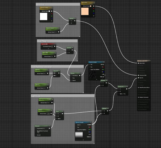
Fake light shafts:
I was playing around with some settings on my lights within the level - I originally wanted to create light shafts using a rect or spot light, but this didn't work particularly well, as I had the exponential height fog where I wanted it and playing with the settings threw the scene off slightly.
So to find ways of creating fake light shafts without a light source, I created a cone within 3ds max and applied 2 base textures to it, a gradient texture and a dust texture.
The gradient acted like the light shaft itself, whereas the dust would cut through the light ray, acting like floating particles without the need of a Niagara system.
The overall it gives a fake effect as if there were multiple spot lights in this section of the level.
.png) |
| Light shaft master Material |
The master material contains various attributes that you can control via the material instance, such parameters are:- Base colour (Self explanatory)
- Emissive colour (Chooses the colour for emission)
- Emissive boost (Controls the brightness of the emission)
- Dust tiling (Gives you the ability to tile the dust procedural texture without having to extend the UV unwrap)
- Speed X and Speed Y (Animates the dust depending on what value you input in the X and Y parameters, which is connected to a panner, which makes the dust directional)
- Transparency Strength (Controls how translucent/opaque the material appears on the mesh)
- Outline (Determines the strength of the edges on the material)
There are a few other things connected, such as the gradient, the gradient is connected as an alpha to the dust so the dust can only appear within the gradient boundaries. Furthermore, the gradient acts as an opacity mask so I was able to feather the edges of the material via parameters.
Omnibus:
After doing some further research, I wanted to create some kind of vehicle to carry supplies to the brewery, a horse drawn cart would have worked, however, I wanted to go with something more exciting, so I went with an Omnibus.
 |
| Omnibus example |
Omnibuses tended to be for people carrying, however, to draw some narrative elements, I thought about it having the ability to carry items for the brewery. It could be transporting workers there with some items (which I will model and texture separately.
I divided my model into subsections to make texturing easier. By utilising material IDs, I was able to texture each part individually. It would have its downsides to texturing this way, i.e: I would be unable to put AO and dirt on respectively all over the model to make it cohesive, but it would have been impossible to texture the whole model on a single UV sheet and using a trim sheet would have given me less control over the ware, dirt buildup etc.
Key:
- White: Undercarriage
- Green: Main carriage
- Blue: Glass (Done via shader)
- Pink: Advertisements and upper carriage
- Yellow: Chairs
Here is an example of a decal sheet consisting of all the made up makes and brands I will be using to texture the omnibus.It is my intention to use real and fake brands as there are only so many real brands you can use that are potentially within the public domain, so making something that looks 'timely' is very crucial.
Here is the texturing inside of substance painter, consisting of the previously mentioned advertisements as well as taking into account the colour scheme of the real life reference.
This is the final inside the level, it is subject to change and art direction as it may be too obstructive where it is.
Road and spline mesh problems:
When creating my road through the level, I wanted more control over the length and shape of it, therefore creating a spline mesh seemed like the correct thing to do.
However the problem I encountered, especially with curving meshes, is the problem of crumpling in corners. I tried some basic troubleshooting, such as changing the spline type from curve to linear and constant, which seemed to do nothing. I scaled the road to make it smaller, which also didn't work.
So in the end I decided to scrap the road in a spline mesh.
 |
| Notice the crumpling in the corner of the mesh when I try to turn it. |
In the end I went with the modular way, this was slightly inefficient as I would have to go back in and make multiple lengths, mirror the bends etc. But in the context of my level, the 2 modular pieces I created worked fine.
 |
| Clicking on the modular pieces |
To create the cobblestone, I took a cobblestone texture from my primary texture source library. Using Substance sampler, I was able to change a few things, like making it tile, clearing seams and most importantly, waterlogging the texture with the default water fill inside of the software.
Even though Substance Sampler has a dirt option to fill the height map, I decided that the dirt wasn't particularly great. So I opted for using the height map in Substance Designer and pulling the levels up and down, as well as vector warping via a flood fill to partially randomise the material, this way the dirt looked a little less non-uniform and looked more realistic.
As a final touch, I created a master material for Parallax occlusion (which affected the extrusion of the cobblestone) and vertex paint so I could add material breakup.
 |
| Vertex painting between the red and green channels |
Due to the parallaxing effect, I was able to make some part of the vertex painting sink in, these were the puddle parts, whereas the dirt and regular cobblestone sticks up.
The material overall was quite expensive and I had to delete 2 samples from the set so I could render it - the 2 I deleted were a height texture object (I reused the base cobblestone for the base and dirt variants.)Then I also deleted the Channel pack for the dirt cobblestone (and reused the base channel pack from the the regular variant)
I had multiple material parameters on this material, most of them were for quality of life, just in case I needed to alter things, such as the tiling, min and max parallax steps, shadow penumbra etc.
I could have potentially added mesh decals over the top of the road, however, I decided against this as I wanted more control over where I could place the different textures.
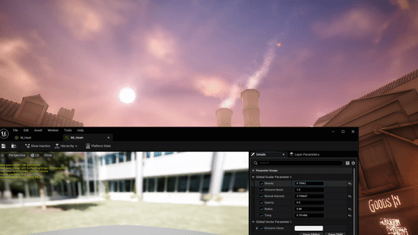
HDRI and additional lighting adjustment:
After some feedback, it was said that the light in the scene looked too harsh, especially in terms of the cloud and sun intensity.
So after searching around, I decided to add an HDRI from my scene.
I downloaded this HDRI from Polyhaven, called 'sky is on fire' - by, Greg Zaal. It has a very evening style colour palette, so I used this in combination with my sky sphere and clouds.
Still pending further feedback, this is how the sky now looks. It is a lot less intense, so it gives the other lights in the scene room to breathe as before the lights couldn't be seen as clearly reflecting the specularity of certain materials.
Procedural Dirt material:
Using a mask and absolute world position, I was able to create a dirt mask for assets within the level. This technique would be useful to apply to random objects within the level in order to add ware and dirt on top of it.
To create this effect I used a dirt texture connected to the already existing material.
In this example I show the process on the omnibus wheels.
This is the master material that lerps between the base colour, normal and channel pack of the dirt material into the pre-existing texture, in this case the wheels of the omnibus.Parameters include:
- Dirt Height (Affects the level of dirt that covers the entire texture)
- Dirt Fade (Affects how sharp or blurred the divide is between the dirt and other texture)
- Dirt tiling (Affects the tiling of each dirt texture, including base colour, normal and channel pack)
Furthermore, the mask controls B, which in terms of unreal co-ordinates is the Z axis, when combined with absolute world position, this is affected by world space co-ordinates in the level, rather than affecting the local material. If it affected the material, it would cover the UVs at multiple weird different angles.

.png)
.png)


.png)
.png)
.png)


.png)

.png)

.png)
.png)


.png)


.png)


.png)


.png)

.png)
.png)
.png)
.png)
.png)
.png)