Saturday, May 4, 2024

FMP Project reflection/Post Mortem

This post is a chance for me to reflect on my FMP.


Overall I am quite satisfied with how it turned out - mainly diving into things I wasn't too sure I could do before such as unreal blueprints and troubleshooting them.

However, if I could change one thing about the project, I would definitely have taken another look at the lighting mainly because it doesn't look quite naturalistic and people noted that the lighting made the level look a touch stylised, which in itself isn't necessarily a bad thing but in the context of what I was trying to achieve, i.e: realism, some of the assets fall flat with the lighting.

Furthermore, another change I could have implemented as part of previous feedback, which was to add my brick texture into substance designer to change some of the roughness values as it looks quite uniform.

But overall, the way everything came together and to have the level playable was more than I thought I was capable of doing.

When it comes to bringing knowledge from this project to future projects, the one main take away for me is my materials, mainly because I used the raw substance sampler scan data rather than taking it into designer and altering some of the values. Additionally spending more time to gather feedback was really useful for this project as it helped the art direction a lot and went from quite a stylised scene with basic texture readability to being more readable and realistic.

One thing to investigate further for future projects will definitely be the RGB mask process. Given I tried it a bit in my scene with the bricks, trying to change the workflow to mainly tiling and incorporate the RGB masks as this is one workflow that is used quite a bit within industry.

Monday, April 22, 2024

Games Production: Major Project (Week - 30)

 Clock:

By this point, I was stretching to find extra stuff to put inside my level.
So to expand my shop, I made a clock.
It is fully functional via a blueprint.


Here is the result of the blueprint in engine.

I was able to achieve this with help from this tutorial by Darkfall: https://www.youtube.com/watch?v=2c2T7NPfcOw

I have a Grandfather clock at home, so I was able to record the ticking sounds from within the clock.

Here is the clock in question.
Originally, I wanted to attempt to photoscan the clock, but it was too heavy to move, so I avoided that idea in the end.

After I recorded the sounds, I noticed there was a lot of background noise, so I put it in my editing software to post process.
Adding a noise gate to isolate the highest frequencies, I.e: the actual clock noises, then I added a small bit of reverb to emulate the sounds of echo within the shop space.
After this was done I imported them into unreal and put them after the delay on a flip flop node, so when the clock hand moved it played each sound one after the other.
One problem I did encounter within the blueprint was when the sound played, you could hear it everywhere in the level. So to prevent this I had to make a sound attenuation within the content browser and assign this to both of the sounds.


The asset render may be subject to change, but here is what it looks like in full within marmoset toolbag.

Monday, April 15, 2024

Games Production: Major Project (Week - 29)

Further Feedback:

Throughout the development of the project, I have had a lot of feedback from multiple people. To give the project that final push I wanted to ask many people for feedback in order to improve the project as best as I could for submission.

Kras' Feedback:

I was speaking to Kras about how I could change a couple of things within the level. One main thing he pointed out was the sun and its colour. 
In original screenshots, the sun always had an almost off-white colour, but Kras recommended I change this to a slightly more saturated colour to imply the sun.

Older screenshot with slightly washed out colours.

Newer screenshot with slight light saturation and darker shadows (I intend to put a separate light next to the bollard to give it some ambient light via a new lighting channel.)

Another suggestion that was recommended, to deform the regularity of the playing cards on one of the tables.
He mentioned - 'think about when you drop cards, they would scatter in this pattern due to the way you hold them, but there wouldn't be this arc to it'
This was possibly to imply that the fellows at this table may have needed to leave in a hurry, or in a drunken manner, put down the cards. Which would result in a harsher put down of the cards and wouldn't be as elegant as the initial screenshot.

Cards in arc format

Cards in new arc format with several cards being displaced

When looking at my shop Kras mentioned something about lightshafts, so using the pre-existing materials and meshes from my other lighting scenarios, I used.


Petros' Feedback:

I was speaking to a peer of mine, Petros. He suggested a few things, one of the main things was to have a little bit more breakup on the roads.
To do this, I used the same technique on the cobblestone that I did for my bricks.
Where I added an RGB mask I painted on top of the texture in photoshop and used this to divide some of the pieces of cobblestone into sub-sections to light, darken or hue shift at random intervals.

Older cobblestone without randomness

Newer cobblestone with randomness (Notice the slightly different coloured pieces)

Furthermore, I enhanced breakup by adding some more subtle atlases to the top of the cobblestone.

In this example you can see slightly darker black specs and off coloured dirt from the other decal atlases I have used around the level.

Sam's Feedback:

I had a meeting with Sam Taylor from realtime who advised me about a few things in my scene.
He pointed out a couple things that could be changed.
List of changes:
  • Water pump: It was noted that my normal intensity was too high on the water pump causing it too look too bumpy. Furthermore, the rust buildup wasn't realistic enough, because rust occurs with water and oxidisation and I didn't have rust around the pooled areas like it should be.
  • Large Barrels: The large barrels in my scene are nicely detailed, however, they could do with having the wood detail be smaller as the wood grain looks too large at the minute.
  • Numbered jugs: The jugs in the shop have labels on them, but from a distance they look too bright and they stand out the most when entering the shop.

Water pump:


Pump without rust

Pump with rust

Large Barrels:

Barrels before change

Barrels after changes (Increased normal intensity and grain size)

Jugs:

Labels before changes

Labels after changes

Gabrielle's Feedback:

Gabrielle mentioned a few things I could add to my level.
One of the main changes was for the shop interior, he mentioned to me that the wood floor was tiling too much, so some break up was needed.

This is how it looked with wood flooring (He also mentioned about having some smaller assets to act as an 'aisle' within the shop - but I will cover that in the next part of the feedback)


Here is the shop divided into 2 sections with wood and carpet, I made the carpet within substance designer.


Small shelving unit change:

A few posts ago, I tried to justify me not having items in this area because it would take up a lot of room.
But since then, I have planned out what I would do next.

Gabrielle mentioned that I could take the already existing shelving units and just cut the size of them down in order to reuse the asset.


What I did to achieve this was to make a duplicate of the mesh and cut it so only the bottom 2 crosswise pieces of wood were present. I then mirrored and capped the asset before re-UVing it.

Gate:

Another suggestion that was made was to imply space outside of the level. I had already done this with one of the larger gates.
But Gabrielle suggested I added in a smaller gate that implies leading off somewhere.
So I added a smaller gate.


Teo's Feedback:

When discussing my level with Teo, she suggested some things in the level.

Shop wood floor:

One of the things that was recommended was within the shop. The wood looked a bit too uniform, it would be good to imply the wear on where the floor had been walked on.
So I did this via vertex painting.
I took my already existing texture and passed it through substance designer, to add various grunges, scratches and to change the colour of the texture.
Finally I subdivided the floor mesh and brought this into engine, this allowed me to vertex paint on top of it


Here is the floor before.


Then here is the floor after vertex paint to imply worn wood from the amount of times it has been stepped on and things have been dragged across it.

Immersive Changes:

I initially had help using this tutorial by gorka games

I replaced the original sound cues with a single sound cue which played the sounds with a 'random' audio function.

Random Sound cues


This was correlated with the Physical material directly tied to the blueprint (I changed the physics names in the project settings)


Example of the Physical material for wood on the wood mesh


In the animation, I called the notify that was set to call at the end of the blueprint.


Notify calling each physical material with an attributed sound.


Replacing the old animation class with the new 'manny' class

New manny character in level


Here is a visualisation of the puddles inside the level, (I attached a transparent material to the mesh so it wouldn't be visible), but the collision is still present, meaning the notify cues would still be triggered when these areas are walked over.

Step by step process:

  • I created the Audio inside of my editing software, adding various effects such as reverb.
  • I then imported these to Unreal engine, then put them all into single sound cue with a random node to randomise the audio.
  • Going into the project settings, I attributed all of the physical material names.
  • I then created the blueprint with the previously mentioned video and applied the respective audio cues.
  • I then went into the 'Manny' skeletal mesh animations and created a notify on the timeline for each of the animations that required it, such as run and landing from a jump.
  • Removing the old first person arms skeletal mesh from the first person character blueprint, this was replaced by 'manny'.
  • I checked on the cast shadows from the manny skeletal mesh.
Result: walking over the respective meshes with physical materials will then fire the audio tied to the physical mesh. All the while you can see the character you are playing as.

Finalising light complexity:

I took the opportunity to bring down the lighting complexity.
I achieved this by flushing certain assets down different lighting channels. My main directional light contains a 0 and 1 lighting channel, 0 being the main light and then 1 being for ambience. So when looking around my level, I saw opportunities to put some lights and assets on lighting channel 2.

Overall, the highest in my scene is around the red zone on the indication bar.

Light complexity from the main camera

Light complexity from above

Light complexity from within the shop

I didn't find it necessary to put certain assets on a light channel, especially from within the shop. I have a light on the ceiling that projects downward to ambiently light objects, but because some assets got overpowered by the intensity, I disabled the asset's lighting channel. The main look of the items were being carried by the post process volume, so even with no lighting channel it still looked cohesive. 
Furthermore, because I had the directional light affect certain assets in the shop, I made sure to turn off the setting within the asset - 'Affect dynamic indirect lighting' - this way I was able to remove some of the harsh bounce lighting caused by the directional light.

Indirect lighting harshly affecting assets on the display stand

Affect dynamic indirect lighting disabled for the asset, removing the bounce light from the other assets

Additional building changes:

When looking at my work, I noticed that the brick work didn't make much sense in some areas.

On the left hand side of the level, it says 'alberton brewer established 1865', although it was said that these brick elements don't make much sense as they look 'glued on'


Looking at one of my main factory references, in this case Cairn's Brewery in Liverpool, there is an inset where the bricks look almost carved in to the inset.


I tried to replicate something similar with my work. However, the only thing that differentiates the work is the fact that mine has all of the words inscribed into this one area.
I did this because I feel like it gives narrative and background to the area it is in, I could have just made single words and wrapped it around the wall, but this wasn't a direction I wanted to go down.
When implementing this, I replaced the original 2x 3x3M wall with a singular 6m modular wall and replaced the left hand wall with the new mesh, putting it into place.

Additional test renders:

I was always looking for the best way to render the scene, normally I would use high resolution screenshot, but for this test I used the level sequencer. I set up cameras for stills within the level sequencer and in the render settings I used the following:

Command line encoder using the FFMPEG codec with delete source files turned OFF and set to epic quality
Command prompt function enabled with r.screenpercentage enabled and turned up to 150
Anti-aliasing override set to 16 Temporal samples
FPS set to 12 (animation) to reduce render time as it was for stills and not cinematics
Furthermore, the level sequencer on export turns on cinematic quality by default - I made sure to enable 'epic' texture quality as well before rendering.

The advantage of me putting FPS on a lower setting helped render quicker, but also in my movie renders folder, it gave me a couple of options for pictures to chose from as source files weren't deleted once the render was completed.

I used photoshop to post process the images, only subtle image enhancements such as: 

Sharpening
Depth of field (because Unreal can be really hit and miss with this, especially when glass shaders are involved)
Colour correction modification
Birds (Who doesn't love birds?)
Contrast boost

Here are a few samples of the renders:


Carpet Clumping:

I had some feedback regarding my shop area. It was mentioned I could potentially add some frayed pieces of carpet derived from an alpha.
But instead, I opted for a method where carpet clumps where furniture has been moved.
I created a simple mesh inside of 3ds max and used this as my base.


In this example, you can see the dark spot where the clear outline of the carpet occurs


But to fix the issue, I created a small section in my material where I added a depth fade - the one downside to this method was it involved me turning my material translucent.


Here is my changing parameters which affect the depth fade, when I change the opacity of the depth fade (while using the absolute world position on the Z axis) the carpet texture almost seamlessly blends from the bottom causing it to act like the carpet underneath without having to make it a single combined mesh.

Thursday, March 21, 2024

Games Production: Major Project (Week - 25)

As my level progresses into the finalisation stages, I wanted to think about how to execute certain renders.

I had already made my marketing/brand layout, it was just a case of getting renders ready for photoshop.

Opting for 2 methods of renders, the main level renders would be done in unreal, then smaller asset/prop work, textures and breakdowns would be done inside of marmoset toolbag.


Here is an example of a slightly older engine test render.


This is an example of a prop breakdown done inside of marmoset toolbag, where I rotated the item and also put the visualisation mode on to render the wireframe seperately.


These are the examples of the logos I made inside of photoshop to show the more graphical elements within the level.


And these materials were rendered separately, but I stitched them together inside photoshop after they were rendered out of marmoset toolbag.


Costermonger Cart:

To fill out more space in my scene, I did some research into what potential props I could add to the scene.
I was told not to add any more assets to the road, otherwise it would block the main camera view.
So I opted to put another asset off to the side so it isn't disrupting the level design flow, but the player could go up to it if they wanted to look at the asset.

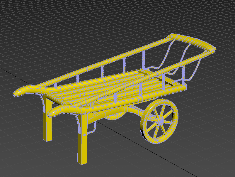
So I made this asset a Costermonger cart. After researching victorian goods, I had already made potatoes to go in the scene, then I came across a costermonger, of which is a vegetable and fruit travelling salesman.


Here is some references I pulled up for the costermonger cart, it had really nice shapes and silhouette, so it would be really nice to make this exact model.


The model only has 16,450 tris, which isn't bad for an asset like this, considering there is a lot of form changes and cylinders. The bit that heavily ups the tri count is adding boxes with vegetables inside it.

To create the vegetables I created basic shapes, in the case of the carrots, I made a basic cylinder with about 5 subdivisions, then using the soft select tool I pulled and pushed verts to make it look more organic.

MassFX Rigid bodies:

Then when I had finished creating the vegetables I wanted to drop them into the wooden boxes. To do this I used the rigid bodies modification. I placed all the vegetables above the crate then set these to my dynamic objects. I then set the crate to static object. I finally baked the simulation once I was happy with the positioning of the vegetables and deleted any that fell out of the boundaries.


When I was satisfied with all the placement of the vegetables, sent the meshes to texture inside of substance painter.


Here are what the vegetables look like after texturing them inside of substance painter - I opted for 2 carrots, 2 spring onions and a swede, I added rope on a plane as well, because I wanted to tie some of my onions up into bunches.


While I was at it, I also textured the cart. Making sure that it was worn and dirty as usage of this cart through fields and general ware would make it look like this.


With all the vegetables and wooden boxes in place, the tri count came to a staggering 98k - however, I wanted to make it as realistic as I could with my current skills and the tri count is something I had to sacrifice to do this. However, I plan on utilising this asset as a nanite mesh.
I applied material IDs to the final export so I could easily attach the relevant textures to the meshes.
Without the vegetable meshes and boxes, the cart itself is in the range of 16.5k tris, which for a hero asset, isn't particularly bad. It is hard to make something 'photorealistic' and game ready at the same time, it almost seems impossible to do this with tileables and a restricted geometry count.


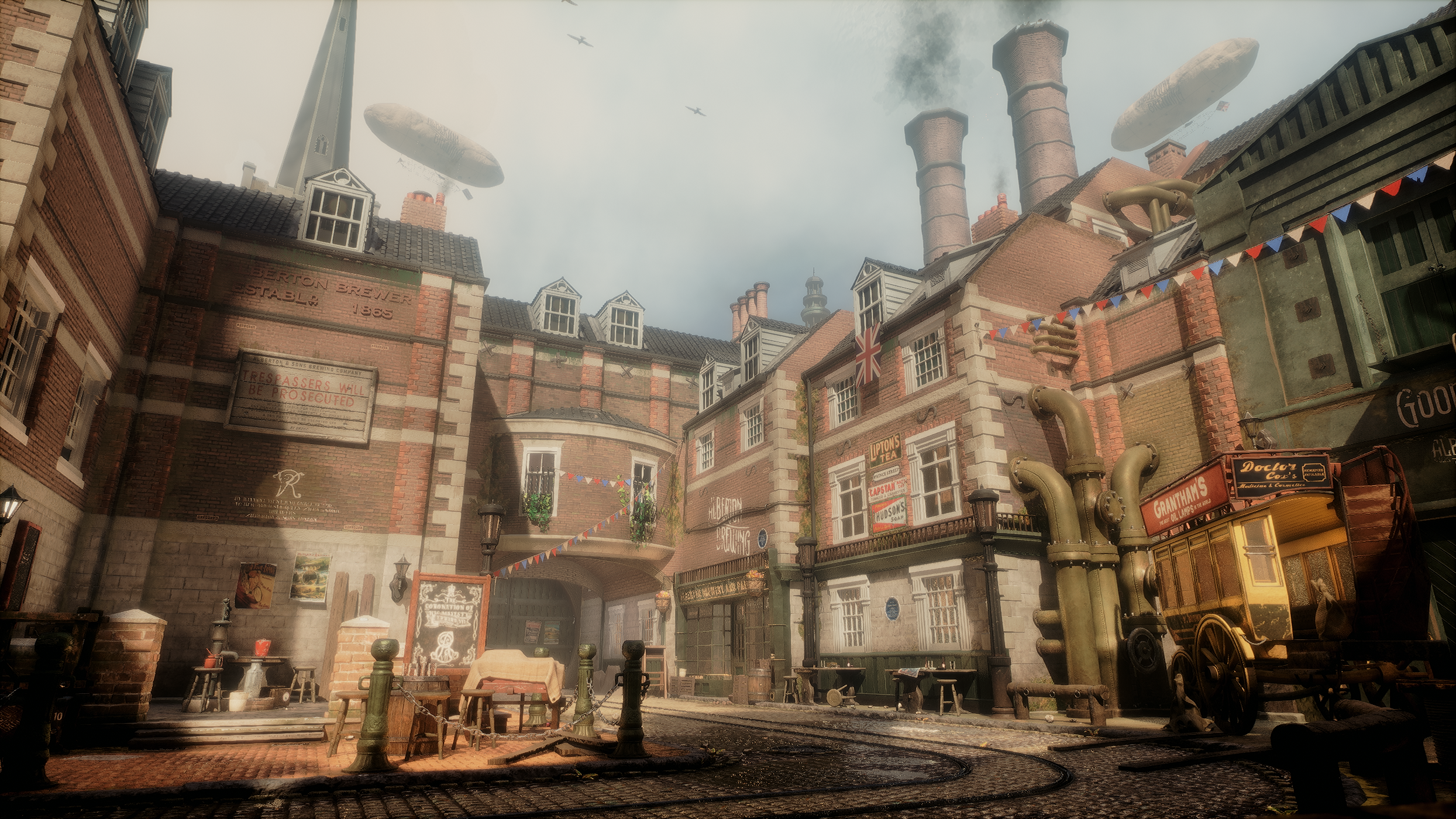
This is what the model looks like inside of unreal. I really like how it turned out. Having the modelled assets really makes a difference.

This part of the map is nicely filled up. Furthermore, I have some audio playing behind the gate, with these assets here the player might be enticed to investigate this area and might stumble across the audio while looking at the assets.

Marmoset renders:

For the final touches I went ahead and rendered the asset inside of marmoset toolbag.


I added a shadow catcher plane in order to have some drop shadows on the asset.

After rendering the asset from multiple angles, I put it into photoshop to do my presentation pass and post processing.


This is the final result. I am really happy with how the asset turned out, it is one of my favourite renders out of all the assets I have created.

Lightswitch change:

I had some feedback regarding my lightswitch - it was recommended that I change it from the 6 switch design to a single switch that controlled them all.
However, all is not lost because I could reuse the six switch design elsewhere in the level and retain the same UV space.


Optimisation pass:

This was one of the more difficult tasks to undertake, not necessarily from an optimisation standpoint, but more for a quality vs performance standpoint.

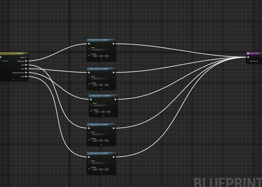
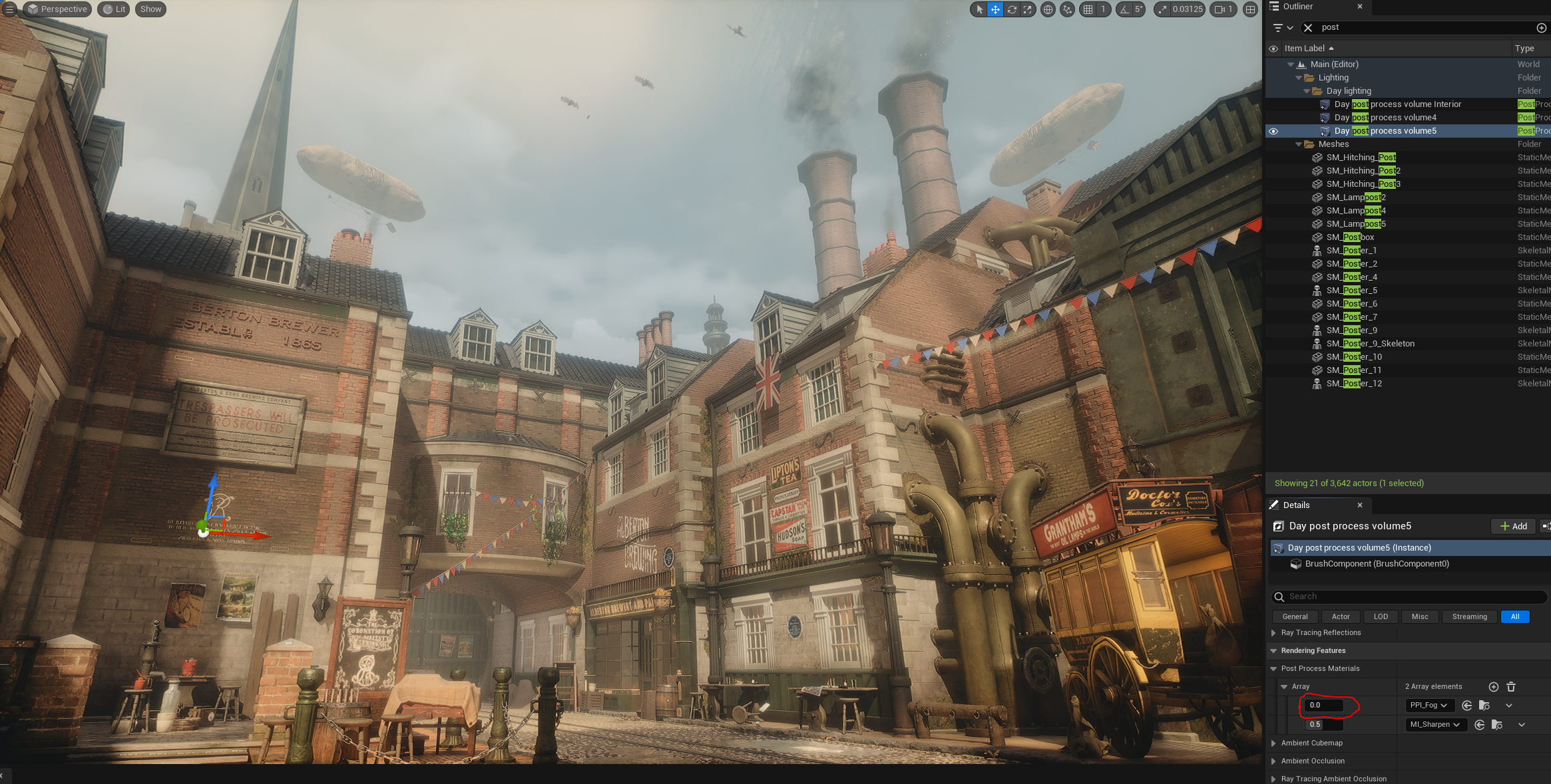
I enabled profile gpu via the console command to see what was costing the most.
I noticed that it was lights that were the key issue.
To make it look nicer in some spots, I set the shadow default to raytraced enabled - to combat certain lights causing problems, I went into the light and disabled cast raytrace shadows and did this for all lights that were not affecting shadows in the scene, this mainly included bounce lights or lights that lit up dark areas, as the directional light would be doing most of the heavy lifting.

Another one that caused issues was my skylight - the skylight was profiling about 2.40, but since I downsized the cubemap texture size from 512 to 128, that statistic has gone down to 0.40


After checking my post process volume, I saw that hit lighting for reflection was turned on which was causing reflection costs to go up. However, shifting this to surface cache marginally improved performance and I also believe it looks better as it almost gives the windows a slight glare which when viewed from certain angles can be more realistic.

Sky colour changes via post process material:

After searching online on how to add some cheap volumetric fog to my scene, I came across this tutorial by PrismaticaDev - https://www.youtube.com/watch?v=7TXe1rgpW2c
I played with some of the original settings within the material instance that was created and it ended up adding to my sky. Rather than create a 'volumetric' per se, it instead indirectly added to my skysphere colour and made it more 'smoggy'


Level without fog post process material enabled.


Level with for post process material enabled.

It is a subtle difference, but I like how overcast it now looks with the extra hints of grey, furthermore the cream/orange offshoot of the volumetric cloud is now more apparent after the change.

Local fog:

I wanted to create some subtle low lying fog which could add to the atmosphere of the scene - I did this via a hanging particulates niagara system.
However, the majority of the control was within a material instance.

Affecting exposed paramaters in the material instance


The key to this material was the depth fade and absolute world position.
By multiplying the Z of the world position with the depth fade nodes, I was able to essentially drag the fade from the floor up to the top of the texture.
This way, the particle wouldn't just clip through the floor.
Along with various other fade options for the opacity, such as radial gradient exponential, this material instance gave me a lot of control over how the fog works.

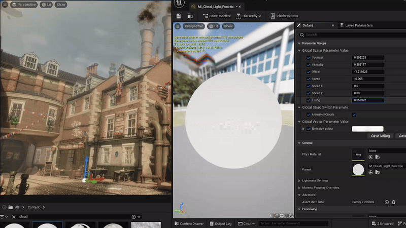
Cloud light function:

For some additional depth to the scene, I created a light function for the directional light

I created the cloud texture within Substance Designer in order to make it tile and alter the levels, I did this with a simple clouds 2 and changed the random seed.
Various parameters on this material include:
  • Tiling (Able to tile to clouds texture)
  • Offset (Offset the original cloud texture)
  • Panner (Animates the clouds)
  • Speed X + Speed Y (Changes the panning speed on the respective channels)
  • Speed (Changes the directional speed for both channels)
  • Animated clouds? (Static Switch parameter so act as an on-off switch for the clouds to move or be stationary)
  • Intensity (Increases the outline of the clouds)
  • Contrast (Increases the gap between the light and dark of the texture)
  • Emissive colour (acts as a boost for the brightest value range)
Instead of trying to get the volumetric clouds to cast shadows, it was more effective to have this as a base light function for more control over the material, rather than relying on the shape of the clouds, giving the overall scene more art direction potential.


Litter:

Another piece of advice I received was to create some litter for my scene just to dirty it up a bit.
So the way I decided to put litter into my scene was via to foliage tool inside of unreal.


I created several meshes of already existing textured assets, such as discarded cigarettes, crumpled paper, squashed boxes and used these as my base meshes.


Tutor feedback:

Recently I had some feedback from craig regarding my fmp - one of the pieces of feedback was to do with the shop.
He mentioned that the shop needs some extra assets to make it feel more 'shop like' - which I understood.
However one of the points that was mentioned was to maybe add some tables with items on it, I decided to rule against this piece of feedback as there was minimal space between the counter and the opposite wall to justify putting any sort of object there without it feeling cluttered.


Here is a very rudimentary drawover for the shop, demonstrating the various lengths of assets.
Tables can vary in size, but in the case of a shop that has to demonstrate multiple items to be the most appealing to customers, of which I believe a reasonable size for a table like this would have to be at least 2m x 2m for the dimensions. Giving the player only 0.5 - 1m of room to walk by, I don't believe this would work for a shop of this size.


I did take onboard the idea of other items.


Here is a screenshot with some additional items. The items in question consist of: a chair, numbered metal jugs and a metal bucket.


For the jugs, I drew inspiration from this image.
Furthermore, I created 6 images in photoshop to correlate with the jugs in question, using this as a mesh decal on top of the jugs.

Number stencil created within photoshop

Chair Reference